







You notice it the moment you step inside. A small bathroom or compact kitchen can feel suffocating, even when it is perfectly functional. The challenge lies in making limited square footage feel intentional rather than restrictive.
Most design advice for small spaces circles back to the same playbook. Choose lighter paint. Maximize artificial lighting. Add reflective surfaces. These strategies have their merits, but they overlook a surface that influences spatial perception more than any wall treatment.
Your flooring choice carries enormous weight in how a room reads.
The dimensions of each tile shape the rhythm of the entire floor. Large format tiles disrupt the visual clutter that traditionally shrinks a room's perceived boundaries. Understanding why requires a closer look at what makes standard tile installations feel cramped.
Where Small Tiles Fall Short
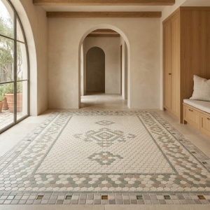
Go back to the flooring found in most older bathrooms. Small-format mosaic tiles — one or two inches per side — dominated for decades.
They served certain purposes well. Mosaic surfaces offer excellent grip underfoot. They handle sloped substrates with ease, which is why contractors still favor them in shower pans.
But deploy them across a flat bathroom floor and problems emerge. Each tiny tile demands its own grout line, and those lines multiply rapidly across even a modest footprint. The result is a dense lattice of joints that fragments the floor into countless small zones.
Your brain processes that visual noise as confinement. Rather than perceiving one unified surface, you register a choppy grid — and the room immediately feels tighter than its actual dimensions warrant.
How Larger Pieces Change the Equation
Large format tiles reverse this dynamic in a straightforward way.
Any tile measuring 15 inches or more along one edge qualifies. Common dimensions include 12x24, 18x36, and 24x48 inches, with some manufacturers producing even more expansive options.
Fewer individual pieces means fewer seams between them. A floor composed of eight 24x48 slabs replaces what might have required over a hundred small tiles. The reduction in grid lines is dramatic.
Walk into a room surfaced with these broader pieces and your eye glides across the floor without interruption. The surface appears continuous, almost borderless. That visual seamlessness creates an impression of depth and openness that no amount of paint can replicate.
Fewer Joints, Better Light Distribution
A second advantage has nothing to do with pattern and everything to do with light behavior.
Grout lines sit slightly recessed relative to the tile face. Even with expert installation, each joint introduces a shallow depression. Those depressions collect microscopic shadows — individually trivial, collectively significant in a room without strong natural illumination.
Reduce the total number of joints and the floor reflects light with far greater consistency. The surface stays brighter. The atmosphere lifts.
This is particularly valuable in interior bathrooms and hallway kitchens that lack windows. Every photon matters when artificial light is your primary source.
Dark Surfaces Do Not Have to Shrink a Room
There is a persistent belief in interior design that dark tones belong exclusively in spacious rooms. Pale floors, soft neutrals, nothing too bold.
The reasoning is logical but incomplete.
When you remove the busy network of contrasting grout lines through oversized pieces, dark colors behave differently. A floor composed of deep charcoal slabs with matching grout reads as a single, unified mass rather than a collection of dark fragments.
That unified surface acts as a visual anchor. Place it beneath lighter walls and the contrast draws the eye upward, toward brighter tones and the ceiling above. The room feels grounded at the base while simultaneously expanding overhead.
Visit a well-stocked ceramic tile shop and you will find dark-toned oversized slabs specifically designed for this purpose. Examining them in person — seeing how light plays across a large, uninterrupted surface — makes the concept tangible in a way photographs cannot.
Continuing the Pattern Vertically
Carrying the same tile from the floor onto the walls intensifies the sense of expansion dramatically.
This technique has become particularly popular in wet rooms and compact en suites. Using the identical 12x24 or 24x48-inch piece on both horizontal and vertical surfaces creates a seamless envelope.
Grout lines flow from floor to wall without breaking alignment. Your eye loses its ability to detect where one plane ends and another begins. Corners — the very elements that define a room's limits — visually dissolve.
The result feels architectural rather than decorative. Boundaries recede, and a tight bathroom begins to read as a considered, immersive space.
Installation Realities in Confined Spaces
The visual case is compelling, but fitting substantial pieces into tight quarters involves practical hurdles worth understanding before committing.
Tile direction deserves careful thought. In an elongated room, aligning the long axis of each piece with the room's longest dimension stretches the sight line naturally. Perpendicular placement shortens it. The difference in perceived depth is noticeable.
Access complicates things too. Maneuvering a 24x48-inch slab through a narrow doorway requires planning. Dry-fit your cuts outside the room first, and consider trimming pieces around door frames before bringing them inside.
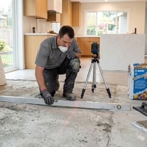
Subfloor preparation becomes non-negotiable. Larger pieces amplify any substrate imperfection. A minor dip that would go unnoticed under mosaic tiles becomes a crack risk with broad slabs. Before selecting your materials, a visit to a ceramic tile shop can help you determine the minimum flatness tolerance for your chosen dimensions. Self-leveling compound addresses most irregularities but adds a preparatory step that cannot be skipped.
Choosing Grout That Disappears
Even with substantially fewer joints in the floor, grout selection remains a detail that determines whether the effect succeeds or fails.
To maximize the continuous appearance, match your grout color to the tile as precisely as possible. Pair light tiles with light grout. Pair dark tiles with equally dark grout. The objective is to render the joints invisible from normal viewing distance.
Introducing a contrasting grout color — white against dark tile, for instance — effectively draws a visible grid across the surface. Every tile gets outlined, which undermines the very continuity you worked to achieve.
For joints that remain visually subtle over time, consider epoxy grout formulations. They resist discoloration far better than cement-based products, though applying them demands more patience and technique. The long-term payoff is joints that stay as invisible as the day they were laid.
Taking the First Step
You do not need to enlarge a room physically to make it feel larger. Changing the floor surface alone can reshape how the entire space is experienced.
Start by researching your options in person. Walk through a ceramic tile shop and handle the oversized slabs yourself. Notice how a single broad piece looks compared to the same area filled with small tiles. The difference in visual weight is immediate.
Discuss your room's specific conditions with knowledgeable staff. Subfloor flatness, doorway clearances, and directional layout all influence which sizes work best. Bring samples home and place them against your existing floor — you will see how the larger format changes the room's energy almost instantly.
With careful material selection and sensible preparation, large format tiles offer one of the most efficient paths from a cramped room to one that feels open and considered.