





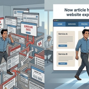





You have invested heavily in your digital presence. Your branding is sharp. Your content strategy works. Your traffic numbers climb. A visitor arrives on your site. They explore your offerings. They feel compelled to reach out. They navigate to your contact page. Then, without a trace, they exit.
What caused the disconnect?
In almost every scenario, the contact form is the offender. It serves as the final checkpoint between curiosity and commitment. When that checkpoint feels like a roadblock, visitors retreat. Let us unpack why your contact form is shedding leads and how you can mend the leak.
Field Fatigue Deters Completion
Your audience moves quickly. They will not tolerate a lengthy intake process for a simple inquiry. Examine your current form. Count every field you require.
If it solicits first name, last name, email, phone, company, title, headcount, and budget, you have built a wall. Each additional input erodes your completion rate. You do not need this depth of information to begin a dialogue.
A name, an email address, and a message field are typically sufficient. Gather the rest as the conversation progresses. Keep the gateway narrow. Make it painless for someone to express interest.
Phone Number Mandates Create Anxiety
This is a pervasive conversion killer. Many individuals simply avoid phone conversations. They favor the asynchronous nature of email. They may be in a noisy environment. They might be multitasking while commuting.
Requiring a phone number triggers immediate hesitation. They envision an unwanted callback. If your form enforces this field, relax the rule. Make it optional. If a prospect welcomes a call, they will include their number voluntarily. If you insist, you forfeit the lead.
Mobile Experience Breaks Down
A significant portion of your audience browses on handheld devices. If your form is cumbersome on a phone, you are actively repelling potential clients.
Minuscule input areas are difficult to select. Tiny toggles lead to accidental activations. If the form neglects to summon the correct keyboard—such as a number pad for phone entries—users grow exasperated.
A knowledgeable website designer grasps that mobile forms demand dedicated attention. Touch targets must be generous. Type must remain legible at default scale. The interface should feel purpose-built for small screens. Test your form on your own device. If you encounter friction, your visitors encounter it too.
Seasoned marketers know that mobile form issues often hide in plain sight. Bringing in a website designer with a mobile-first mindset can reveal problems you never noticed.
Labels That Mislead and Vanish
Design fads can undermine usability. Consider inline labels. Many forms embed the descriptor inside the field. It appears elegant. But the instant the user taps in, the label evaporates.
If they shift focus and return, they cannot recall what the field requested. This breeds mistakes. Mistakes breed frustration.
Position labels permanently above the input. They remain visible. They offer unwavering direction. Use accessible language as well. Abandon internal terminology. Replace "Department Code" with "Which team should handle this?" Plain speech outperforms ornate phrasing.
CAPTCHA Barriers Repel Real Users
Spam is a genuine nuisance. No organization wants an inbox cluttered with junk. Yet a stringent CAPTCHA is an effective method for screening out legitimate visitors.
No one appreciates identifying blurry fire hydrants in a photo grid. No one wants to solve arithmetic to transmit a message. Rigorous CAPTCHAs decimate conversion rates. Actual humans falter. They abandon the attempt.
Superior alternatives exist. Deploy a honeypot field. It remains hidden from people but bots populate it automatically. If data appears, the submission is discarded. Invisible reCAPTCHA offers another path. It evaluates behavior covertly. It assigns a confidence score. You exclude spam without alienating genuine visitors.
The Post-Submit Void
What greets users after they press send?
If they encounter only a muted "Submission received" notice, you have squandered an opportunity. If the form resets without acknowledgment, they assume malfunction. They may resubmit. Or they may depart in irritation.
Construct a distinct confirmation page. Validate receipt. Define the timeline. "We have your message and will respond by end of day." This dispels uncertainty. It affirms that their effort mattered. You can also route them toward supplementary content, such as your resource library or newsletter signup.
Buttons That Blend In and Copy That Bores
Your submission button wields more influence than you realize. If it reads "Submit," it feels like an obligation. It sounds impersonal.
Opt for warmer phrasing. "Reach Out" or "Start a Conversation" resonates more deeply. The button must also command visual attention. Select a vibrant color that contrasts with your palette. It should be prominent and unmistakable. Do not shrink it into a drab, undersized rectangle. Make it a compelling destination.
A strategic website designer will also evaluate your button's position within the visual flow. Placement above the fold typically outperforms forms buried at the bottom of lengthy pages.
Absence of Measurement and Iteration
You cannot refine what you refuse to quantify. Do you monitor how many users land on your contact page? Do you know what fraction completes the form?
Without these figures, you operate on instinct. Implement event tracking in your analytics platform. Observe abandonment patterns. If your form spans multiple stages, pinpoint the exact dropout location. Experiment systematically. Modify one component. Assess the effect. Marginal gains accumulate. Regard your contact form as a dynamic instrument, not a static fixture.
Recognizing the Need for Expert Intervention
Occasionally the challenges transcend form configuration. The page may lag. The markup may be bloated. The layout may bury the form where few scroll. The plugin may conflict with your framework.
If technical work lies outside your expertise, self-directed repairs can compound the damage. This is the moment to engage a specialist. A capable web design company can scrutinize your contact page. They can reconstruct the form for velocity and flawless cross-device performance. They can ensure the codebase is streamlined and secure.
Do not permit technical deficiencies to undermine the audience you cultivated. Certain complications require professional resolution.
When screening a web design company for this engagement, inquire about their approach to conversion rate optimization. The most effective partners blend design sensibility with analytical rigor.
A thorough web design company will also examine heatmaps and session recordings. These tools reveal exactly where users hesitate, scroll past, or abandon your form.
Final Thoughts
Your contact form is not a security checkpoint. It is an open invitation. It is the first gesture in a professional relationship. When you keep it lean, responsive, and transparent, you attract more inquiries.
Strip away the obstacles. Eliminate redundant fields. Replace punishing CAPTCHAs with intelligent alternatives. Perfect the mobile experience. Communicate clearly on your confirmation page.
These adjustments are uncomplicated, yet they yield meaningful results. Dedicate ten minutes this week to evaluating your form. Complete it on your phone. Determine whether the process feels effortless. If it does not, implement changes immediately. Every day of inaction costs you potential business.