




Time is the one resource people guard most fiercely. When a prospect decides to engage your services, they expect to secure a slot without delay. Every unnecessary hurdle chips away at their patience—and your revenue.
For service providers, the reservation interface is the front door. A clunky entry discourages guests before they ever step inside. A smooth, intuitive welcome builds confidence and keeps your pipeline flowing.
Here is a roadmap for creating that experience.
1. Chart the User's Route
Before evaluating any software, trace the path a visitor follows to book. Launch your site in an incognito window. Tap the scheduling button. Observe each transition.
Count the steps. Every additional screen or decision point increases the risk of abandonment. A high-performing system carries a user from intent to confirmation in well under a minute.
Draft the perfect sequence. It should unfold like this: arrive at the homepage, select "Book Now," choose a service, pick a date and time, provide basic contact details, and receive immediate confirmation. If your existing sequence includes account registration, email verification links, or lengthy intake questionnaires, friction is costing you business.
2. Choose Proven Platforms Over Custom Builds
Developing a proprietary booking engine is rarely practical. Costs spiral, bugs multiply, and ongoing maintenance drains resources. Existing solutions have already solved these challenges.
Tools like Calendly, Acuity Scheduling, or Setmore manage calendar integration, time zone handling, and automated notifications. An experienced Singapore web designer regularly counsels clients that licensing a proven tool outperforms custom development by a wide margin.
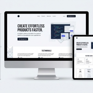
The art lies in integration. A capable web design agency embeds the scheduling widget so seamlessly that it mirrors your site's aesthetic—matching palettes, typography, and spatial rhythm. The visitor should perceive a single, cohesive environment, even if third-party technology operates behind the scenes.
3. Engineer Visual Continuity
When your homepage looks contemporary but your booking screen resembles a bare utility, visitors pause. The visual break signals a drop in quality.
Embrace generous negative space. Avoid compressing the calendar, input fields, and terms into one dense panel. Make action buttons prominent and thumb-friendly. Select type sizes that remain legible without magnification. A refined interface inspires trust. An outdated or glitchy one triggers doubt about your broader competence.
4. Restrict the Information Ask
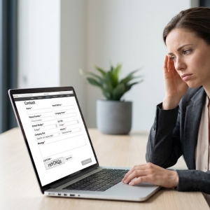
This is the most common failure point. Businesses treat the booking form as a comprehensive intake survey.
A thirty-minute consultation does not require a client's full biography. Each additional field compounds resistance. Audit your current form. If it requests phone, email, home address, employer, and referral source, you are overreaching.
Gather only what confirms the appointment. Typically, a name and email address suffice. If supplementary details aid your preparation, solicit them through a follow-up communication after the slot is reserved. Lock in the commitment first. Collect context afterward.
5. Optimize for the Mobile Majority
The bulk of your traffic arrives via smartphone. People arrange services during commutes, in queues, and over lunch breaks.
If your system demands zooming, pinching, or navigating microscopic controls, abandonment spikes. Test the entire flow on your personal device. Are tap targets sufficiently large? Is the calendar readable? Does the page render promptly?
A thorough web designer validates the mobile experience across diverse screen dimensions. If a modal obscures the calendar or the confirmation control vanishes from view, the system is defective. Mobile is not an accessory channel. It is the dominant pathway for securing appointments.
6. Neutralize Time Zone Friction
Serving clients across regions introduces a subtle but serious risk. Your afternoon slot may land in their late morning. A missed connection damages credibility.
Robust scheduling platforms detect the visitor's local time automatically and present availability accordingly. Verify this capability is active. Include a concise note near the calendar: "All times displayed in your local time zone." This modest addition prevents missed meetings and frustrated exchanges.
7. Insert Strategic Pauses
Friction undermines your operations too. Appointments stacked without gaps guarantee delays. A tardy provider disappoints the subsequent client.
Configure buffer intervals—ten to fifteen minutes—between sessions. This creates space to decompress, review materials, and mentally reset. Clients never observe these buffers, but they benefit from a provider who honors punctuality.
8. Automate Confirmations and Prompts
Confirmation is not the endpoint. People forget. Schedules shift.
Dispatch an immediate confirmation message. Keep it brief: specify the service, the time, and include a direct link to modify or cancel. Do not force a phone call for simple adjustments. Empower clients to self-manage.
Trigger a reminder twenty-four hours in advance—via text or email. This single intervention dramatically reduces absence rates. When engaging a web design agency, ensure they establish automated connections between your booking tool and communication infrastructure.
9. Define the Post-Booking Path
Once the appointment is set, articulate what follows. For phone consultations, clarify who initiates the call. For face-to-face meetings, provide location and parking guidance. For virtual sessions, distribute the video link without delay.
Ambiguity creates anxiety. A straightforward "What to expect" segment in the confirmation message eliminates uncertainty and reinforces professionalism.
10. Diagnose Abandonment Points
Invisible problems require visible data. Integrate analytics with your booking pages to identify precisely where visitors disengage.
If a significant portion exits at the calendar stage, the interface may confuse them. If they abandon the form, it is overly burdensome. A skilled web designer implements event tracking to surface these vulnerabilities. Review metrics regularly. Implement incremental improvements. Monitor whether completion rates respond.
Final Reflection
A frictionless booking system is defined by subtraction, not addition. The corridor from "I need assistance" to "My appointment is confirmed" should be as direct as possible.
Keep questionnaires minimal. Rely on validated platforms. Prioritize mobile interaction. Accommodate time zone diversity. Automate routine touchpoints.
When reservation feels effortless, completion rates rise. And when your calendar remains consistently full, growth follows naturally. Evaluate your current configuration today. Measure the steps. If the process exceeds sixty seconds, refinement is warranted.